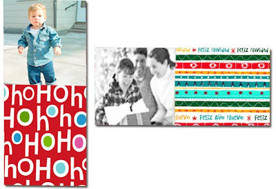
Today is the first official day that we are officially accepting YourHoliday submissions, officially.
Please read everything on the YourHoliday landing page (hallmark.com/you), get inspired and think (RED) as you submit your one official and wonderful entry.
We can hardly wait to see what you all come up with. Feels a bit like the holidays in July. Which is nice. In this heat. :)
Happy Entering!
Judgy
Monday, July 28, 2008
Be BO(RED) no more. ENTER the YourHoliday Card Competition.
Tuesday, July 22, 2008
Some size clarification
Dimensions/Layout (pick one):
*Option A: Vertical holiday card (5 x 7) (note: this is for your design’s printable space – your actual image should be as big as 5.5 x 7.5 to give a little wiggle room for our automated card-cutting machines, so we don’t chop off any of your brilliant concept. This is called the “bleed,” coincidentally.)
*Option B: Horizontal holiday card (7 x 5) (note: this is your design’s printable space – see above for explanation of what the heck that means.)
Click on the picture to get a larger view of the fine print.
Monday, July 14, 2008
YourHoliday Card-Making Tips
Hint #2 is up on the YourHoliday site. Go check 'em out.
And in case you don't have time to jump over there and see all the goodness, here are the basics:
*"Design" = anything from the most simple drawing to something more fancy. You can include words in the design or not. We want this to be fun for everyone.
Now, go! Create!
Monday, July 7, 2008
YourHoliday Formats
The real, live page isn't quite built yet. We're still tinkering. So in the meantime, you'll find hints right here... which might actually be better 'cause you can ask any questions you have to ask right away. It's not fancy schmancy. But it's helpful. That counts for something, right?
As you're thinking about your submission for the YourHoliday card competition, one very important thing to consider is the FORMAT of your card.
In this competition, we are asking you to create designs for something different than what you did in the first three competitions. The YourHoliday contest is all about "flat photo cards". (You know, the kind people stick on their fridges around holiday-time.)
* Your challenge is to create a design to go on a such a card. (And to make sure your design will look good beside somebody else's holiday photo.)
* You'll also get to choose whether your design is vertical or horizontal.
So, are you up for the challenge? Do you know what we're talking about? We think it'll be a fun one. And we hope you do, too.
Speaking of Holidays

We'll be unwrapping hints on the YourHoliday contest page until submissions open. Just not today.
We promise we're working hard to bring you the juiciest hints possible.
Still, even worker bees like us need vital time away for fireworks, cookouts, and shenanigans. (Can you blame us for loving parades?)
We hope your weekend gave you a chance for a hot dog or two and some time to play in the sun!
Wordy & Judgy
P.S. What we can do today is post some hints right here on this blog. Later today. So that's something. Something great.
Saturday, July 5, 2008
Funny*ness Shameless Self-Promotion #5: Sharon

Some might say I'm funny, others might say I'm funny looking--either way, I'm good.
Friday, July 4, 2008
Thursday, July 3, 2008
Funny*ness Shameless Self-Promotion #3: Sandy
Wednesday, July 2, 2008
Hard at work
Working away night and day
To give you some hints and show you the way.
We know you can't wait to see what's next.
Racking your brains, we're sure you're perplexed.
We're cooking up contests and judges and prizes
And, more than likely, a few surprises.
So take a peek into our shop
And see the work just never stops.
Funny*ness Shameless Self-Promotion #2: Yashira
Tuesday, July 1, 2008
Funny*ness Shameless Self-Promotion #1: Kristi

Hi, I'm Kristi. Thanks for taking the time to read a little about me! :) I believe that I've been truly blessed with a zany and child-like sense of humor that allows me to laugh at myself and find "funny" in the otherwise mundane! Unflattering self-photos, silly faces, and, ahem . . . noises associated with "bodily functions" always precipitate a good belly laugh! As you can see, my card design reflects the very foolishness that I find laughable . . . I hope it gives you a smile, too! :)


